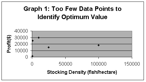
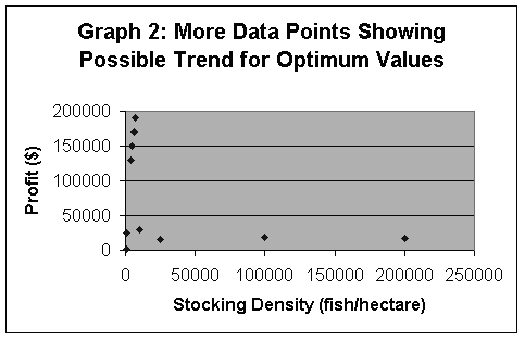
The Results: What your data will look likeIf you try a few of these experiments and compare your data on a graph, you may simply see a cluster of data, without any clear indication of where the optimum value would be (Graph 1).
Note that none of the profits in Graph 1 are near the goal of $235,000. You want to be able to compare a wider range of values, with many intermediates (Graph 2). This might seem like a lot more work, but more work now will pay off later. If you try too few values, you may have to come back and redo more experiments, trying to figure out why your initial impression of the optimum value was incorrect. Remember that the range could be as high as 100,000 fish per hectare.
|

